OUR Brand
how we look
our logo
These branding guidelines will help you determine the best way to use our logo. Web and Print versions of the logo are ready for you to download and use as directed a little further down this page.
Our logo is a very valuable asset
We must treat it nicely. We make it nice and easy with only a few steps.

Print Logos
This logo is to be used for all printed collateral including all printed publications, advertising, billboards, posters, flyers
and product packaging. The logo can be used with or without the strapline.
The Black and White or single colour version is only for situations where colour is not an option.

Screen Logos
The same logo is to be used for all screen work, including websites, banners, and presentations. Please make sure you are using the size that fits best for your needs.
All recomended size options have been prepared for you in web ready formats to download.
[useyourdrive dir=”0B5iOkdmvBzM1LVdyQmdGTWFSOFk” mode=”files” viewrole=”administrator|editor|guest” downloadrole=”all” filelayout=”list” candownloadzip=”1″ roottext=”Tapaas Brand Elements” notificationdownload=”1″]
Do’s and dont’s.
You take the time to dress well. Take a moment to think about how to apply the Tapaas logo.
01 Space around the logo
Always leave the logo some space to breath. Use white or neutral backgrounds.
02 When using the strapline
Leave the logo some space to breath its just a little different with the strapline. Use white or neutral backgrounds.
03 If the unavoidable happens
If you simply have no option to sit the Tapaas logo on a colour or image we prefer you use the negative logo.
04 Red alert!
Do not sit the logo on yucky colours. You can work with our colours.
05 Not cool
Do not use the positive or negative logo on backgrounds that are too light or cluttered.
06 Not right
Do not rotate or tilt the logo.
07 Not outstanding
Do not add embelishments like drop-shadows, embossings etc. to the logo.

Thanks for not embellishing on the logo with shadows, patterns, intricate backgrounds, or elaborate gold jewelry.
Our colours
These are what give us or personality. We’re bright, bold, colourful and confident. They’re simply warm and friendly.
Primary Colours
Tapaas Brown
Brown PMS -
CMYK 0/57/100/60
RGB 124/66/0
Hex #7c4200
Tapaas Green
Brown PMS -
CMYK 0/57/100/60
RGB 80/155/64
Hex #528d47
Tapaas Text
Cool Gray 9C
CMYK 0/0/0/60
RGB 130/130/130
Hex #7A7A7A
Secondary Colours
Tapaas Cream
Cream PMS -
CMYK 10/15/27/0
RGB 228/210/185
Hex #e8d4b9
Tapaas Tan
Tan PMS -
CMYK 38/40/60/7
RGB 157/137/109
Hex #9b876c
Tapaas Teal
Teal 9C
CMYK 60/36/30/0
RGB 115/145/161
Hex #6c8c9b
Our fonts
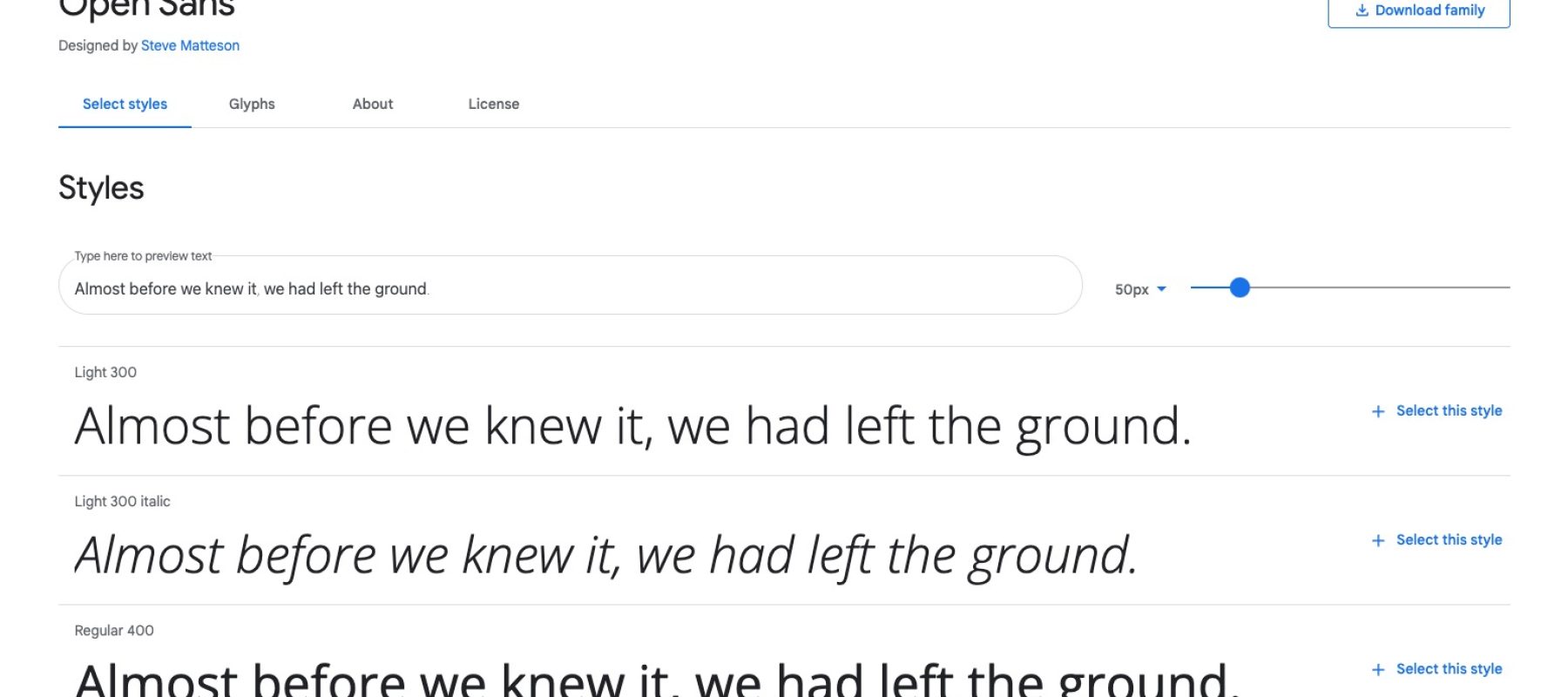
Tapaas has selected the Open Sans font family. A humanist sans serif typeface designed by Steve Matteson, Type Director of Ascender Corp. Open Sans was designed with an upright stress, open forms and a neutral, yet friendly appearance. It was optimized for print, web, and mobile interfaces, and has excellent legibility characteristics in its letterforms. Download Open Sans

When using our brand materials, please include the statement:
"Tapaas and the Tapaas logo are trademarks of Tapaas, Inc."
Feel free to use unaltered screenshots for instructional purposes. Please don't superimpose graphics, change the way our products look, or include any user information in your screenshots. You can annotate as long as the annotations are clearly distinct from the original screenshot. You can find our logos in our press kit.
Use of our brand materials
Please don’t use our name, logos, or screenshots (“brand materials”) in ways that may be confusing, misleading, or suggest our sponsorship, endorsement, or affiliation. For example, your name and logo should be more prominent than the Tapaas name or logo. And please don’t edit or change the Tapaas logo — we like it how it is!
Please check in with us before using our logo on websites, products, packaging, manuals, or for other commercial or product use. It’s ok to say in text “works with Tapaas” or “compatible with Tapaas” (as long as it’s true!).
You can use our brand materials for educational and instructional purposes, but please remember that it shouldn’t be confusing or misleading, or suggest our sponsorship. We generally don’t allow use of our logos or screenshots on book covers, for example.
Also remember to include this statement (or something like it) in your printed materials: “(Title) is not affiliated with or otherwise sponsored by Tapaas, Inc.”
Please don’t use our name as a part of your company or service name, website name, trade name, or product name. Don’t use our logo or incorporate our logo into yours. Don’t use a domain name containing “Tapaas” or any confusingly similar words.
Developers of our API can use brand materials in accordance with our Developer Branding Guidelines.
If you use Tapaas and want to use our logo to link to our site, you can use our logo if it meets the rest of these guidelines. For example, “we use Tapaas! [linked logo or link near logo]” or “here’s a photo set (hosted on Tapaas!).”
While we make lots of t-shirts with our logo on them, we don’t generally allow third parties to make, sell, or give away anything with our name or logo on it.
Feel free to email brand@tapaas.com. It helps if you send a mockup of your intended use so we can be specific in our response. We’ll do our best to get back to you ASAP but please give us two weeks to get back to you. (Please note that no response doesn’t mean approval and that we’re currently only able to respond to inquiries made in English).
By using the Tapaas brand materials, you agree to the Tapaas Terms of Service, these Tapaas branding guidelines, and all Tapaas rules and policies, as may be updated from time to time. You also acknowledge that Tapaas is the sole owner of Tapaas trademarks, promise not to interfere with Tapaas's rights in them, and acknowledge that goodwill derived from their use accrues only to Tapaas. Tapaas may review use of the branding materials at any time and reserves the right to terminate or modify any use.